LISTEN
TRAINING APP FOR SUICIDE & CRISIS HELPLINE VOLUNTEERS
Shortlisted & sponsored by Microsoft Research.
Presented at Microsoft Design Day 2019.
Listen is a training application for suicide and helpline crisis volunteers, that allows them to train the listening and empathy skills that are far more engaging, repeatable and scalable.
Role
Researcher, UX/UI Designer, Identity Designer
Project Type
Application
(Sponsored by Microsoft)
Technology
word2vec, p5.SpeechRec
Node.js
Collaborators
Haffiyandi
ChiAn Huang

THE PROBLEM/RESEARCH
INCREASE ATTEMPTS ON SUICIDE
It is estimated that around 5 million people in the US have attempted suicide. It is the third leading cause of death for teenagers and there are at least 111 million people who live in areas with a shortage of Mental Health Professionals.

RESEARCH
INCREASE DEMAND IN SUICIDE PREVENTION HELPLINES
There has been a sharp increase in demand for suicide prevention helplines. The National Suicide Prevention Helpline U.S was launched in January 2005, it received over 46,000 calls. In 2017, the numbers increased to 2 million calls. Because there are people in the U.S who do not have readily accessible health professional help, they relied on the suicide prevention helpline
HOW DO WE DESIGN A PRODUCT, SERVICE, OR SOLUTION THAT ENABLE/CREATES EMPATHY ACROSS A LARGE AND DIVERSE DEMOGRAPHIC?
SCALING UP WITHOUT COMPROMISING QUALITY
We did intensive research on certain helpline centers, volunteers, trainers, and organizers and realize that some callers had a bad experience with the helpline responders. This is unacceptable because life is at risk. We needed to understand how the helpline centers function and how the volunteers are trained. From our research, we learned that
1) Empathetic listening skills are important for responders
2) Training is not designed with user-friendliness
3) Training is heavily reliant on trainers
THE OBJECTIVE
HOW CAN WE LEVERAGE TECHNOLOGY AND CREATE AN EFFECTIVE AND EFFICIENT TRAINING TO EQUIP VOLUNTEERS WITH LISTENING AND EMPATHETIC SKILLS?
Training Application
Mobility
A supplemental training app that makes listening and verbal-responding practices more repeatable, trackable, and accessible.
The application is mobile and can be used anywhere and anytime the volunteer feels comfortable using it, this will allow less dependency on trainers.
Easier reference for training
Training is designed by different topics and hence we choose one that is fairly important first, followed by the rest of the topics.

ASSISTING VOLUNTEERS IN LEARNING, VERBAL AND LISTENING SKILLS FOR THEM TO RESPOND BETTER.

Accessible 24/7
Focussing on one
module at a time
Ai
Verbal Exercises
-05-10.jpg)
THE APPROACH
DESIGNING FOR VOLUNTEERS
From the research that we did, we understand that there is heavy content in the information that volunteers had to learn. They have to be very dependent on the instructors to learn the traits and time is restricted. However, because there is a high chance of conflicting schedules, volunteers are unable to do both of those at the same time. Hence, we had to design around the possibility that the users can use the application to learn at their pace and at the same time, use technology to improve the users' training.
PERSONA


Research & Brainstorming
GETTING USERS STARTED
Referencing from the user manual that volunteers have to go through. We studied the manual thoroughly and learned from experts, we categorize the application into different skills and ensure that users will only be able to move on to the next skill only when completed with the current skill.
USING WORD2VEC
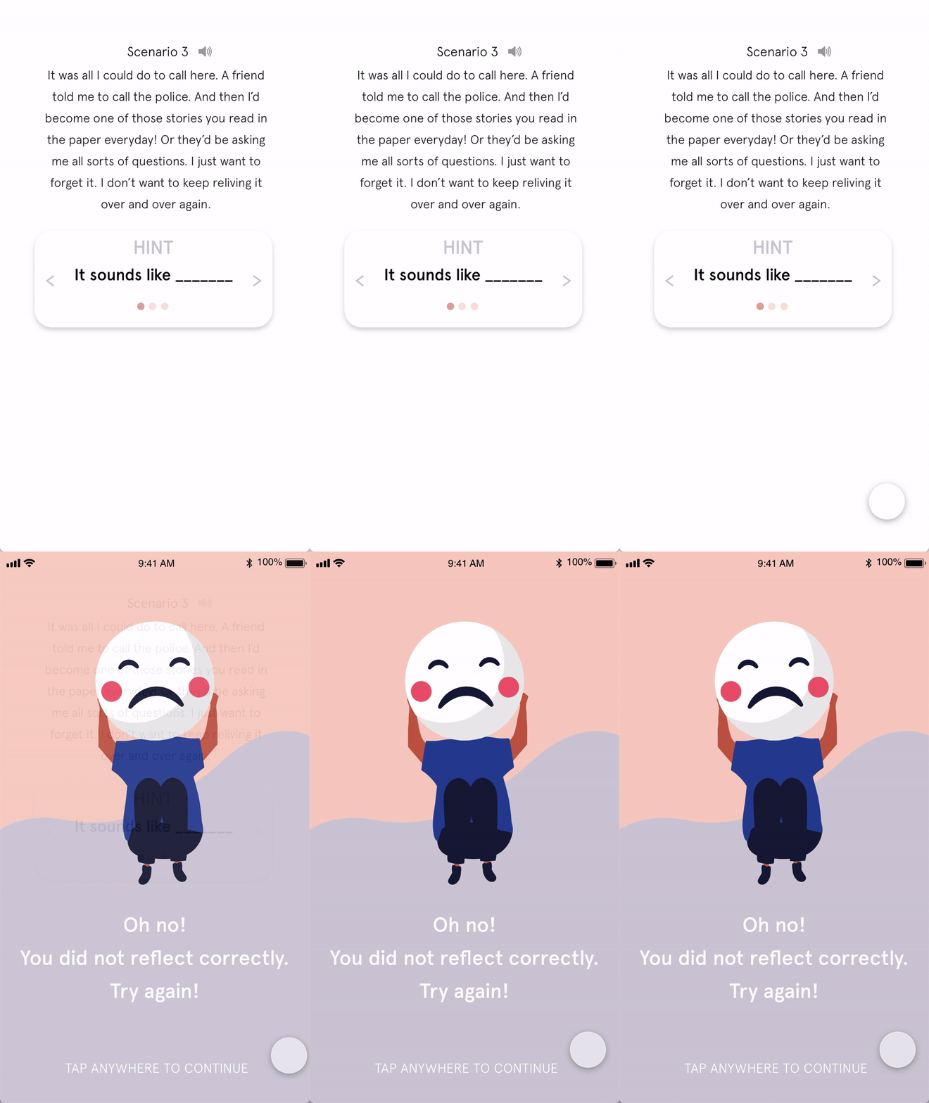
The application uses Word2Vec to match the user's input to the closest appropriate respond. Word2Vec is a group of related models that are used to produce word embedded. In certain of the exercises on the app i.e: Reflection module, the user would need to paraphrase based on the scenario given, and the user is required to use his/her voice.
THE DETAILS
EXPERIENCING LISTEN
To use Listen, it has to be intuitive, efficient and effective for users to use. It must also be engaging and visually appealing for users to keep returning and using Listen to learn the modules.
USERFLOW & WIREFRAME


Empathy is a trainable skill
SIMPLE
TO USE
it is easy for users to use, it is straight-forward
ENGAGING
using less text and more visuals to communicate with users
EFFICIENT
using recent technology to validate users usage
VISUALLY
ENRICHING
illustrations are well designed to make it appealing


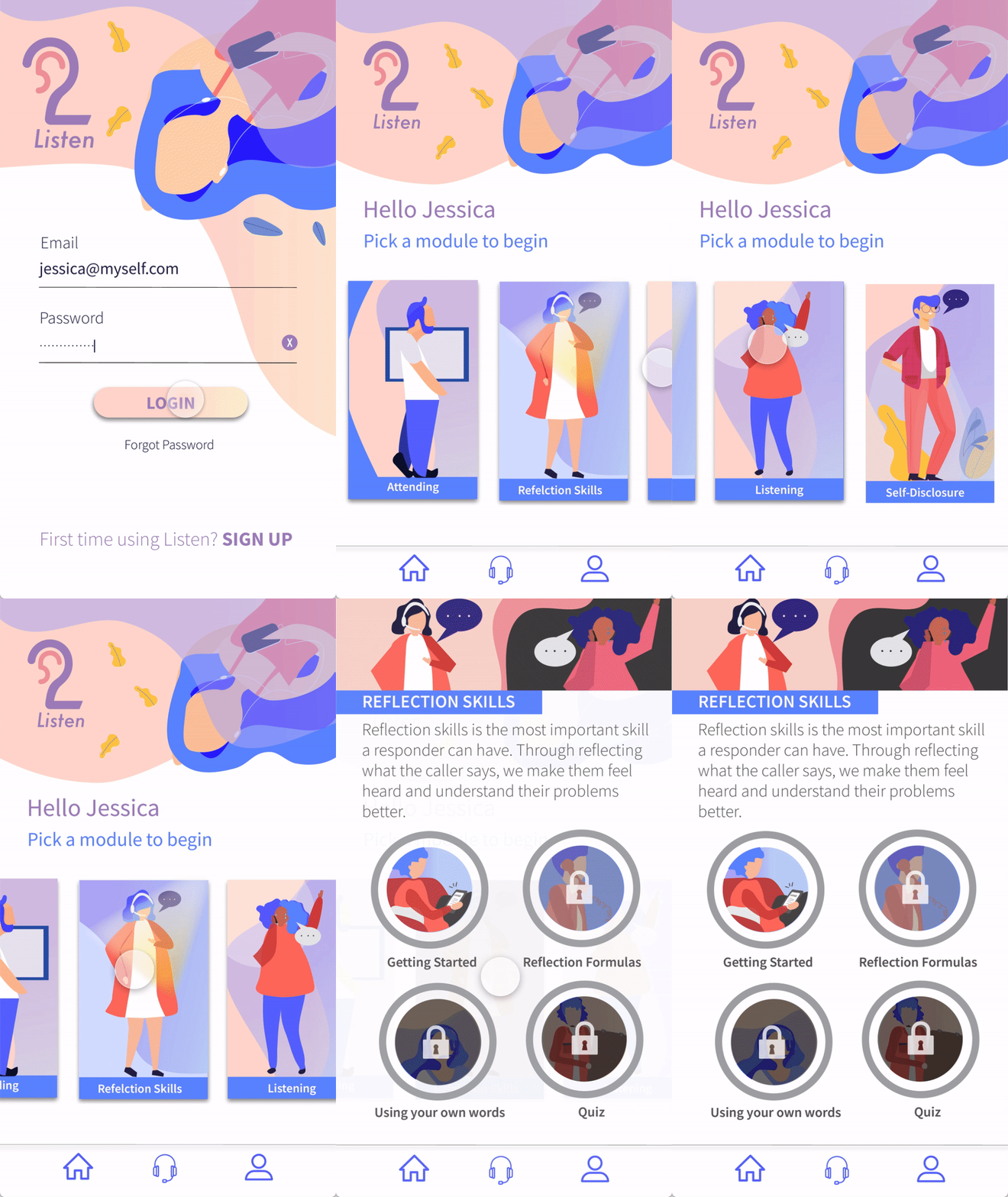
Users choose a module and it will show the progress of the user.
-05-08.jpg)
User will go through a brief introduction of each module before starting the training.

In this instance of the reflection module, users would need to use their voice to practice, the word2vec technology will determine the accuracy of the user's response.


USER TESTING
User testing played an important role in the application. We manage to get people to user test and asked for feedback. Most of the feedback given was positive, they felt it was easy to use and find it very intriguing that the technology used is quite accurate. Areas to improve are possibly the placement of each module to make it more of a standard grid rather than the unconventional design that we have.
PROTOTYPE
MEASURING SUCCESS
Based on the conducted user testing, we arrived with informed data that the application would help responders to gain knowledge and skills at a faster rate and helps to scale a bigger outreach for this trainable skill. This work has been presented and awarded at the Microsoft Design Expo 2019.
IDENTITY / VISUAL GUIDELINES


